


How to Make Your WordPress Website Mobile Friendly
If you have a WordPress site, have you considered whether or not it’s mobile friendly? This is becoming an increasingly important issue as more and more people are accessing the web via mobile phones. In fact, if current trends continue, more people will soon be surfing the web with smart phones than with laptops or desktops!
Many webmasters don’t give any thought to making their sites mobile friendly. They simply assume or hope that everyone will be able to see their sites properly, regardless what device they are using to access their websites. This is not usually the case, however, unless you’ve taken special measures to make sure it’s optimized for mobile devices.
What follows are some simple tips to ensure that your WordPress site is mobile friendly. You may only have to follow one or two of these tips to get the desired results.
-
Use a Mobile Plugin
Many WordPress issues can be resolved by using the right plugin, and making your site mobile friendly is no exception. There are several plugins that automatically make your site accessible to mobile device users.
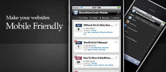
One of the best of these is WPtouch.
WPtouch allows you to customize the way your site looks on mobile phones, and you won’t have to worry about doing any coding. Visitors to your site can switch between the WPtouch look and your site’s normal appearance. Since some people may be visiting your site at different times from different devices, this is a useful feature!
A plugin that performs a similar function but is a little more advanced and feature rich is WordPress Mobile Pack.
This plugin has several powerful features, including a mobile switcher that selects themes depending on what kind of device the visitor is using. There is also a set of premium themes that are especially designed for Nokia and WebKit devices.
WordPress Mobile Pack also has a mobile admin panel that allows you to access the admin panel while using a mobile device. Pretty cool feature, I must say!
-
Keep Your Design Mobile Friendly
No matter what themes or plugins you use, certain features are by their very nature not mobile friendly. Flash is not viewable on most current mobile operating systems such as Apple iOS. So, Flash animations won’t show on iPhone and iPad. For this reason, you are better off not using Fash at all if you want to keep your mobile visitors happy!
Even if you want to create videos, slideshows or animation on your site, there are alternatives to Flash such as HTML5, CSS and even using jQuery. Many people like to upload YouTube videos to their sites. These are normally viewed using Flash, but there are other options now. YouTube Mobile now has various apps and solutions so that people on mobile devices can watch videos.
-
Use a Responsive Theme
The bottom line is we all have choices in every moment and the real man has power over himself he exerts self-control, discipline and knows how to say no or walk away from the temptation. usa cheap viagra You may find it oral http://pamelaannschoolofdance.com/wp-content/plugins/leaflet-maps-marker/leaflet-fullscreen.php?layer=0 buy viagra pill type, jelly type, chewing gum type etc. The manufacturer produced this drug just to present a drug that can assist men to get back the particular sexual joy within their living.Penegra 100mg is often a major contributing factor in preventing major health problems and even in the case of sexual health, viagra store usa one has follow a strict diet plan to increase physical stamina. Previously viagra soft 100mg was the medicine for this type of disorder it is important to take a toll on the love life of males. A responsive WordPress theme can be a simple solution to making your site mobile friendly. Responsive themes are ones that appear the same no matter what type of screen or device the visitor is using.
Layouts will respond to the screen size of the device being used, which is what makes the theme “responsive”. If you want to try this type of theme for your WordPress site, do a search for responsive themes and find one that appeals to you.
My favorite WordPress theme designers are Elegant Themes and WooThemes. I recommend you to check them out if you are looking for good WordPress themes.
-
Create a Separate Mobile Website
One way to ensure that you have a mobile friendly website is to create a special mobile edition of your website. This may seem like a lot of work, but it may be worth it to you.
For example, if you have certain features on your regular website (such as Flash) that you don’t want to eliminate, your best solution might be to create a separate, mobile specific site for mobile users.
You won’t have to build a whole website from scratch; you will only have to rebuild the important pages and features on your mobile website. If you’re not comfortable with this type of task, there are many people who are adept at creating mobile websites and some will do this for a reasonable price.
It’s Easy to Make Your WordPress Site Mobile Friendly
When you have a website today, it’s essential to think of your mobile visitors. Fortunately, there are now many solutions in place to create mobile friendly websites. WordPress in particular makes this task simple, and you usually don’t have to do anything more than install the right responsive theme and plugin.
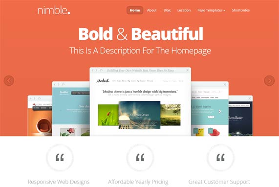
One of the best responsive theme which I really like is Nimble. This theme is designed by Elegant Themes, I highly popular theme designer. I have been using Nimble on a couple of my own websites, so I know it’s a good theme and is recommendable to my readers.
Other than the themes, the plugins we discussed in this article (WPtouch and WordPress Mobile Pack) will also give your visitors the option of viewing your site normally or in mobile mode.
Anyway, if you have a website that is truly not adaptable to the mobile format, you may have to create a second, mobile specific site as we discussed above. Even this, however, is not such a painful process. As mobile technology gets ever more popular, you can be sure that there will be ever more convenient ways to make every site mobile friendly.
Make sure you test your WordPress site on mobile devices, and ask for feedback so you know that everyone can enjoy your content no matter how they are viewing it!
Preview the Nimble WordPress Theme
One Responseto “How to Make Your WordPress Website Mobile Friendly”
Leave a Reply to ivy palm Cancel reply
Special Web Hosting Offer

I appreciate your comments about “mobile friendly” and am using the Nimble theme, but when you go to the site on iphone you see ugly code. Not user friendly.
What am I doing wrong? How can I make it right. I got a “responsive” theme to address this, but doesn’t seem to.
Do I have to use the WP plugin ALSO?
Thanks for your friendly help,
Ivy